Image

Archive for Uncategorized

Your Brand. Is it working for you or against you?

There has been a lot of buzz in the past few years about branding. What exactly is branding? And why is it important?

I was just this morning speaking to a client who was putting together a media kit with some sponsors we needed to add. These sponsors had just paid a significant amount of money to have their company image displayed in variety of marketing materials.  So I asked if they were sending me their brand in a high quality file.  And it happened…again. “the sponsor said just pull it off their web site…that will be fine”.  This is a classic moment of disservice when a brand is degraded and devalued.  Don’t let this happen to your brand. This is just a small example of an instant when the reproduction of a brand is not protected to maintain quality and consistency. So what’s the big deal, right?

Why is your brand so important?  Because it is you, your business and it’s the symbol that represent everything you stand for…it’s your story.  If your products, services, reputation, your vision and business philosophy are important to you and the success of your business is important to you…then your brand should be protected and treasured.  It’s like the big “S” on Superman’s chest. And not just the “S”, his entire costume is his brand.  What if his logo, the big “S” was cracked and peeling and partially missing…and his costume had stains and holes in it and was faded?  And worst of all, what if he had a “beer gut” and he was wearing flip-flops instead of those cool boots, and he forgot to put on his cape that day.  Would Superman be so “super”?  He would still be the same super-strong and super-fast great guy, but his image would be diminished and tarnished.  The perception that we all hold of him being this perfect symbol of strength and freedom and justice might be somewhat degraded. The consistency and unwavering standards and values that he represents may be not so slightly be diminished.  He is still good guy and all that… but maybe in a crunch we’d call Spiderman for help because after-all, he has the coolest outfit, right?  I’m just sayin’ that we all love a cool package when we see it.  And if it is going to help us and it’s really

cool…then that’s the one we want.  This is human nature, especially in this hyper-paced, super-tech, social media, pop-culture driven world that we are all trying to get ahead in.  Who doesn’t want to be a member of the “popular crowd”?  You certainly don’t want to do or say or wear something that will exclude you from the possibility of of being liked or followed.  And who is going to buy a product or service that may work fine and look “OK” when they can have a fun, cool-looking product or service for the same cost…or even pay more.

So, if your brand(logo) dosen’t truly represent who your are and what you are trying to do, then it may be working against you. Yes, as if business and the marketplace wasn’t hard enough, now the very thing that you love and have been using for years and have put on every hat and coozie and any specialty item you could think of, is telling the world that your competitor is so much more “hip” and fun.  It may be showing off how stuck in the 90’s and low-tech and “out-of-style” your company is..and that it’s just a matter of time till you’re not around any more because they just can’t picture a future with you in it.  Ok, I might be getting a bit dramatic. But you get the picture. The biggest and fasted growing demographic in America is…yes you guessed it, the Millennials.  They love tech, they love choices and they want it now and on their phone…and it should be really cool because they love cool, hip things, especially if it makes them feel like they are helping someone who is cool and is like them.  Millennials and what does a good brand look like…that’s for another post, another time.  See ya!

Chilcoat Creative Wins Gold

AAF_logo-1
AddyAward-1


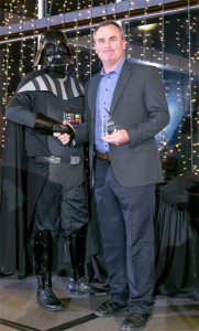
On the evening Friday, February 26, the 2016 American Advertising Federation – Corpus Christi held its annual awards banquet, “The Addy tamucc_foundation_report_cover-2Awards”.  This event is held every year to recognize outstanding creative work in the field of advertising and marketing.  Jeff Chilcoat, Creative
Director and Principal of Chilcoat Creative was there to receive two ADDY Awards.  One, a Gold Addy for the design of the TexasA&M University-Corpus Christi Annual Report. The second, an ADDY for Elements of Advertising, single color photograph for Moddy’s Meats.

Client Team Image for Web SiteThis year’s theme was, ADDY Wars, parodying the release of the new Star Wars movie.  There were Storm Troopers, Darth Vader and a few other Characters from the movie.  It was a lot of fun.  My 12-year-old son would have loved it
There was a lot of really good work shown at the competition this year.  Corpus Christi has quite a few very talented designers and creative directors.  From television to outdoor billboard campaigns, to print and web, all were there to show off the work they did for their clients in 2015.  The event was very well produced and the organizers and the AAF-CC deserve a huge thanks from all who attended and had a great time.  THANKS!AddyAwards_stormtroopers

Engineering Firm Gets Image Face Lift

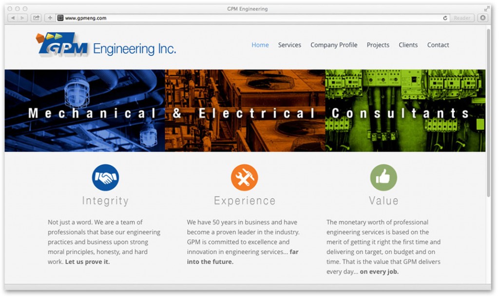
GPM_website-2header
It’s human nature…change is hard.
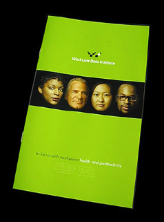
We all like things the way they are…until it gets tired and worn out. When GPM Engineering came to Chilcoat Studios and wanted a new web site…what they really wanted…needed, was a whole new GPM_brochureCover-2look…an image upgrade.  They were making some changes in their business, more aggressive business development and a fresh new approach and expansion.
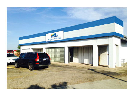
It was time for a change.  It was time for a complete company-wide image upgrade.  So, starting with their updated and evolved logo to a new company brochure and web site, GPM Engineering, of Corpus Christi is taking new strides into the future.  With renewed vigor and corporate branding, GPM has taken a leap to energize their business and staff into the new year and beyond.  Chilcoat Studios has also added new signage and interior graphics to welcome new clients.  2016 promises to be a year of energy, growth and renowned engineering practices.  Chilcoat Studios is excited to have been a part of the transformation of GPM Engineering and stands by them in their future growth and success.  To see the other identities Chilcoat Studios has developed…click here.GPM_building-2

First Impressions that Impress

web_sample_tefsjobfairPoint. Click. It’s “go time”!

When you go to a web site for the first time, what do you notice first? Color, a logo, simplicity, easy of use, Style?  These are all important characteristics.  But most importantly, is your web site working hard for you? Does it effectively communicate who you are and what you do and does it direct prospective customers to take action?  Good questions.

We live in an age of instant communication. The internet, smart phones and tablet computers, all competing for your attention. So when it’s your chance to make a first impression, you only get one. Your web site is your best and most often the first chance your company gets to make a positive impression to a perspective customer. It’s color, it’s images, it’s organization…it’s who you are, and it should capture attention, be memorable and most of all, professional. So don’t rely on your IT guy or some programmer to “produce” your web site. It’s too important as a marketing tool to “just have a web site”. Today people expect to see and  good company brand and a well designed web site that is easy to navigate. It’s fair to say the expectations are high when it comes to packaging. People respond to beautiful things, good design and a simple and direct message.

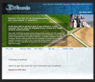
web_sample_jdmineralsMost of the time less is more, and more…is just more.  It’s not always easy to keep it simple.  There’s the message, the products or services, the background, the image, the people, the places, the contacts and so forth.  A web site can be the company hub for information, but it should also be inviting and interesting visually.   There in lies the real challenge. To achieve a balance, a merger between the business needs and the marketing  vision.  If designed properly, both can be satisfied with style and effectiveness.

Businesses survive on customer loyalty but grow with new ideas, new approaches and new markets.  A well designed web site positions a company to grow into new markets and can attract new and different customers. To attract new customers, your web site must be flexible and not tied to a desktop.  The latest statistics show that most people use their smart phones and tablets to search the internet for what they need. Your business web site should adapt and take full advantage of this growing trend.  If your not on the web your losing customers.  If your on the web, you better have your best game face on.

Print Lives.

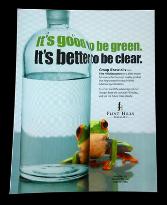
Flint Hills Resources Trade Magazine AdYes, we live in an electronic age and have for some time now. And yes, everything changes, fast. But when it come to personal communication and sales, people still want to be handed something that they can take away with them.  Whether it’s the first impression of a well designed business card or a company brochure, handing out a printed presentation piece is a tactile way for you to connect with another individual.  It’s more personal than an email and a perspective client is much more likely to read it and keep it.  Especially if it is designed and printed well.  Yes, print lives…and works.

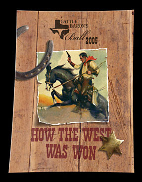
Cattle Barrons Cover ArtIt may be a direct mailer a customer receives, or it may be an advertisement in a trade magazine, but print communication is alive and well.  When you are asked “what do you do?”, your answer should always be framed around how you can help this person or their company. Your company print communications should also be designed to answer this question as well.  But in print, unlike the spoken word, a well designed print piece cannot only communicate the important information about your services or product, but it can represent you visually and stylistically.  It can communicate your attention to detail and focus on quality and value.  For these reasons, a well designed print brochure can sway a perspective client in your favor. When an individual holds your brochure or business card in his or her hands, it is a confident message that you stand behind your work and that it is an extension of you and your reputation.  When something is in print, it can not be withdrawn or edited…it is your word. So it better be accurate and it needs to be well crafted.
WLDI1An experienced and creative designer is a wise choice to execute your print communications. For your next exterior sign, that next billboard ad, or just a simple business card layout, it is human nature to respond well to good design.  Everybody knows it when they see it, because it make you stop and take a little longer look.  It’s all about capturing and holding peoples attention.  Quality professional design does just that, it gets you noticed and remembered.  When you spend money on ad space or a sign or a brochure, your print design money works harder for you when people stop and take notice, when you stand out from your competition.  The world is filled with mediocrity,  yours doesn’t have to.  Quality print design can make a difference in your organization.  Print communication has always lived and worked for business and most likely always will.  Why? Because people want to hold on to something. It’s real, it can be touched and is a direct extension of a you and your standards.  Print lives. Great design works.

Murphy Givens Book Signing Event

Murphy Givens -  Columns 2009 - 2011Nueces Press and the the Corpus Christi Town Club invite you to a special evening with author Murphy Givens and publisher Jim Moloney. Take a tour with Murphy Givens as he reviews his newest book, Columns 2009 – 2011. A compilation of newspaper articles about the rich history of Corpus Christi, the Nueces Valley and South Texas.

Date: October 10, 2014
Time: 6:30 PM – 9:30 PM CDT

The Corpus Christi Town Club

$20 Per Person
Includes Book Signing and Light Hors D’oeuvres
Corpus Christi Chamber Event

Murphy Givens – Columns 2009-2001

Jeff Chilcoat, Art Director of Chilcoat Studios was recently asked by local historian and publisher, Jim Moloney to design a book cover.  This book would be a compilation of stories written by one of Corpus Christi’s most prolific writers and historian, Murphy Givens.   After meeting with Mr. Givens it was clear that I needed to design a cover that captured his quietness, his simplicity and humility.  What was needed was a classic image, a portrait of a man in a simple pose looking right at his audience. With a light that would reveal the quiet dignity and love of clarity that he obviously possessed, I needed to capture his image in black and white.  With a look from a time and era that he was born, I tried to create a personal, close look into the man as he looked back.

When I proposed this creative direction to both Moloney and Givens, Mr. Givens was immediately Columns_cover_webapprehensive.  He was concerned that people would think it would make him look boastful or ego-driven.  But he is far from vain or egocentric. He was inclined to reject my art direction immediately.  But I assured him what I was trying to create was a portrait and an insight into his personality and his life as a writer.  I wanted to be true to who he really is, the man his friends, colleagues and wife know so well.  I didn’t know him very well, but sometimes in a brief moment, you can see things in a persons face, in their voice and demeanor, that communicate years of their life and work.  This was my goal, to capture the story that Mr. Givens face tells, the years and lives he has influenced and his passion for writing about life, past and present.

Graphic design and art have always been a source passion for me.  Working on a project like this, one that is so personal for a client is the most rewarding to me as a designer.  A designer has to take great care when given this trust and treat the task with great respect.  Because it is someone’s life that you are putting on display, not just a face.  Who says you can’t judge a book by it’s cover?  This book invites you to do just that.  Unapologetic and putting it all on the line, Murphy Givens looks right back at you.